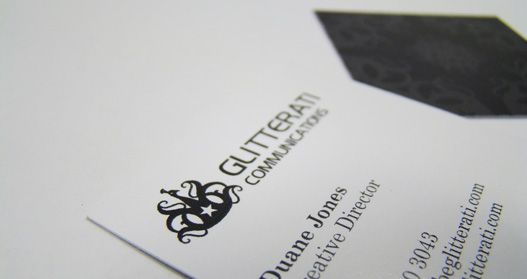
Original Glitterati Communications logo in use
2012 marks six years of existence for Glitterati Communications, aka the father of this Be Glitterati stuff. Four years ago, the peacock symbol and black theme became the main visual elements for the Glitterati Communications identity and its subsidiaries. It took months to design the logo but I eventually settled on the one above.
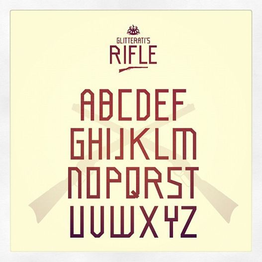
Our logo has generally received positive feedback but there is one area where it lacked in my opinion. It doesn’t read well at small sizes, which is a basic requirement of a logo. We would never design a logo with this issue for a client so addressing this problem has been an ongoing challenge. The logo's font was also an area of contention. We considered going the traditional route by using a classic font like Helvetica, but we eventually ruled that out in favour of a more edgy font (Hancock Park Laser) that reflected Glitterati's energy more accurately. Last year, while developing ideas for the Be Glitterati product line we designed letters for a t-shirt design that eventually became a whole font. That font was named, “Glitterati’s Rifle”.

Glitterati's Rifle Font
We fell in love with Glitterati’s Rifle and began developing a version of it for use as a logo. The whole time we thought that we needed to find the right font when we actually needed to make it.
This re-design will also mark a change in Glitterati Communications's focus. From this point forward we will be more selective of the client work we take on to allow for more time to develop our independent projects like the Future Glitterati series and the product line mentioned previously. Developing the Be Glitterati brand forced us to really think about who we are and how we want to be perceived and a big part of that perception is our no frills approach to design. We don’t believe in over complication and details for the sake of details. We believe in an honest, straight forward approach that gets to the route of our client’s needs. Our first product line takes that same approach as well.
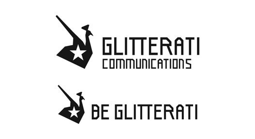
Keeping this in mind, we took our current symbol and stripped it down visually, only leaving a few nods to the original symbol in. Our original symbol was an abstract take on a male peacock. The male peacock is a fascinating bird in that it's color and perceived flamboyance give it traits that humans often attribute to women. A symbol with this duality was important but we are do not want our logo to overwhelm our client work. By opting to keep the logo black in the original design we downplayed the peacock's flamboyance and for the re-design it was muted even further by showing the peacock from the side, a perspective that peacocks are rarely seen from. This was a challenging but rewarding process to go through that resulted in a logo does everything that we need it to do technically and conceptually.

New Glitterati Communications and Be Glitterati logos

Nice pontificating. I really liked reading this, honestly. It's nice to follow the thought trail that produced the new logo. Interesting for the visually uncreative!
ReplyDeleteHa ha. Much appreciated. It's great to get a response from someone who is very verbally creative!
ReplyDelete